This site is under construction.
Poetry Talks:Design
Website Design
Design Inspiration
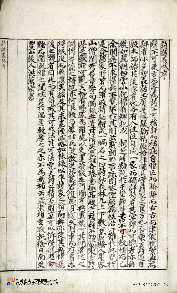
The design of PoetryTalks.org draws inspiration from Chosŏn white porcelain—the same aesthetic world that shaped the Sihwa ch'ongnim, Hong Man-jong's 1652 compendium of remarks on poetry. Refined from the 15th century onward under royal patronage, these vessels were intimately tied to literati culture, their painted motifs often executed by artists from the royal painting bureau. The site's palette follows this tradition: cool whites and blues from cobalt-decorated ware, rust-red accents from iron-glazed pieces, and deeper crimson tones echoing the rare copper-red underglaze works prized for their technical mastery. Double-line borders framing the site's design elements echo the geometric banding found on these ceramics. Background tones of warm beige and soft grey are drawn from hanji, the traditional Korean paper on which literary texts were printed and circulated. Typography follows suit: a serif stack—Georgia, with Noto Serif for Korean and Sinitic script—reflects the classical written tradition from which the texts themselves emerge.
Reference Images


Color Palette
Blues (Primary)
Blue tones are inspired by cobalt underglaze, the most popular decorative pigment in Chosŏn white porcelain.
Neutrals (Background)
Warm beige tones are drawn from the color of traditional Korean paper, hanji, while grey tones evoke the color of faded ink.
Browns & Reds (Accent)
Brown and rust tones reference iron-brown and copper-red underglaze ceramics.
Typography
The site uses a serif font stack to reflect the classical written tradition from which the texts come: Georgia for Latin script, with Noto Serif KR, SC, and TC providing coverage for Korean and Sinitic characters.
Category Identity
Each category, or class, has a dedicated icon and accent color. Icons appear in page headings and on the sides of cards to identify the class of content at a glance.

Entry
--cornflower-blue

Poem
--cornflower-blue

Critique
--cornflower-blue

Work
--dark-brown

Person (F)
--warm-brown

Person (M)
--warm-brown

Place
--sand-beige

Era
--dark-gray

Critical Term
--dusty-rose

Topic
--mauve-rose